Update: June 17th, 2012:
Not loving these. How did I keep the first one I made so clean? The matte medium accumulates fingerprints and dust bunnies. And rather than energetic and fresh, it feels labored and forced.
 |
| I call this one 'paper characters: the racially sensitive edition' |
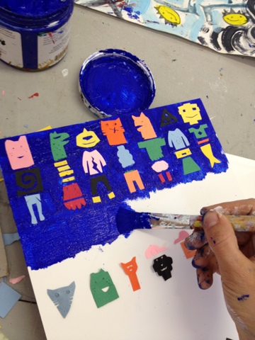
Found a more successful method for keeping the overall picture clean. Rather than using matte medium, I painted a heavy layer of blue acrylic and adjusted the edges with an awl.
 |
| Step 1 for maintaining a cleaner surface: paint background color thickly with acrylic. |
 |
| Step 2: adjust position and flatten edges with an awl. Be sure to clean the awl constantly! |
 | ||
| Another idea. I don't like the way it turned out, it's kinda cluttered and rushed, but I like the whale. And the ninja plant. |
----------------------------------------------------------------------------------------------
The plan: to make a series of these construction paper
character grids. I made this one for the residency and was encouraged to
make some more. Need to go buy some clayboard or panels!
Pros: I think this could be a good confidence builder for me and a good discipline-builder, too.
Plus, I have a feeling these might be 'coffeeshop friendly'-- able to be exhibited and sold, that is.
Once I do the preliminary measurements, they're pretty intuitive to make. I can get lost in the process without having to "think" too much.
Cons: Tedious, labor-intensive, and a bit carpel-tunnel inducing. I may need to watch several series of a television show back-to-back while working on them to retain my sanity.
Any suggestions?
Former marathon TV-art marathon combos have included Avatar the Last Airbender, Buffy the Vampire Slayer, Project Runway, and that strange art reality show called 'I Forget What'. Perhaps Art 21?

No comments:
Post a Comment